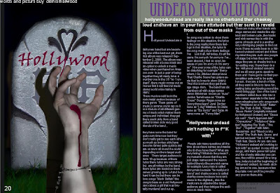
 this is my music magazine i have used a better quality picture i have also used a fue images to make my own posters that would repersent hollywoodundead i also chose the darker colours because as i asked my target audence thes wher the main colours mosted of then would where
Thursday, 13 May 2010
Wednesday, 12 May 2010
Tuesday, 11 May 2010
magazine frount cover
Monday, 10 May 2010
question one evulation

1 In what ways does your media product use, develop or challenge forms and conventions real media product?
My media product is similar to the codes and conventions because I have used the big masthead and the central image has direct mode of address my front cover really sticks to the codes and conventions, both of the main images look similar because there both quite scary looking , also I have stuck to a fue colours to mach other magazines my magazine has purple, white, gray and black , kerrang has crem, black, white and red , I have tried to make my magazine look as similar to existing magicians that my audience would like , so this would attract them to mine .
Both have direct mode of adress
Both have puffs
My magazine has a title for what the main image is
Both of the magazines have an extra something to do with posters
Many cover lines that focus on the main content of the magazine
My magazine
Content page my contents page also is similar to market magazines because the layout is in three columns and mainly consists of pictures , I got most of my idears from exsting magazeans so that it would make mine look verey similar to a real magazeain
and with my double page spread I have produced a similar layout to kerrang which is one of my influences. I have also made up a picture using a gravestone and a hand to create the effect of the undead which is what my double page spread is about.
Things my double page spreds have in common …. They both have a large image on the left hand side with a number in the corner and a little box at the top saying how it is bye , on the right page both magazines have a large title with a little paragth underneath it also both start with a large letter and they also have a quote right in the middle of the article ,
this helps because I have taken this image out of a magazine that is the most popular from my target audience so that will help to attract my audience if they look simaler but mine has its own style to it , my duble page spred is all a bout holly wood undead wich would be one of my target audenceses top bands

Sunday, 9 May 2010
Friday, 7 May 2010
question 2 evaluation
2. How does your media product represent particular social groups?
My media product represents social groups that are all and emo but with a hint of rock and roll you can tell this because of the style of clothes and hairstyles .my questionnaire shows that the favourite colour for emo is purple and black, so I used this in my magazine to attracted my audience, my audience also showed that they like kerrang, which happens to be the magazine that I got some of my ideas the link is below for kerrang.
http://www.kerrang.com/
the link below shows the type of social group that I have chosen , the band that the link shows is holly wood undead witch is also the band I chose fro my double page spread the link shows the crowd off people going crazy for this band . http://www.youtube.com/watch?v=E89NY3a0cZU
Subscribe to:
Posts (Atom)


